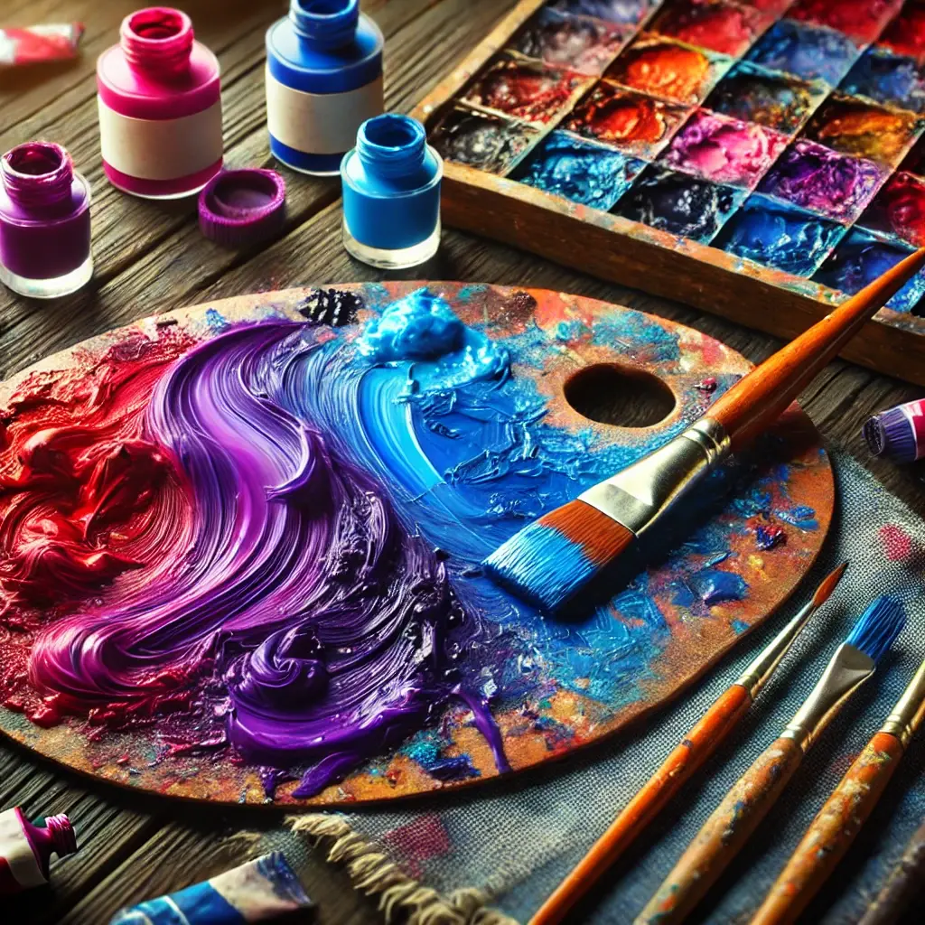
Designers, painters, and everyone else fascinated by the vivid world of colour mixing must first learn the foundations of purple. From calm lavender to regal deep purple, purple is a flexible colour with a lengthy history and a broad spectrum of tones that could arouse a range of emotions and moods. Whether your work is digital, painting, or creative, knowing how to make purple will enable it to achieve hitherto unattainable degrees of complexity. This guide covers everything about creating purple, tailored for Australian audiences.
Understanding the basics of colour theory
Understanding the principles of colour theory, can help you grasp the difficulty of creating purple. Colour theory is the study of colour relationships, the colour wheel, and how colours interact; it is the art of using colour.
Primary colours
Conventional colour theory defines red, blue, and yellow as primary colours. Combining several colours does not allow one to get these colours. Still, they form the basis of every other colour.
Secondary colours
Secondary colours emerge when two primary colours are blended together.
- Red + Blue = Purple
- Blue + Yellow = Green
- Red + Yellow = Orange
Tertiary colours
Combining a main and a secondary colour creates tones like red-orange or blue-green.
How to make purple: The essential method
1. Start with red and blue
Combining the two main colours red and blue lets purple be produced most basically. The purple’s tint depends on the ratio you use.
- Equal parts: Combining equal amounts red and blue produces a balanced purple, sometimes characterised as a pure or royal purple.
- More red: A warmer purple that swings towards magenta or violet results from more red than blue.
- More blue: Usually showing as indigo or deep lavender, extra blue produces a colder purple.
2. Experiment with different shades
Purple encompasses a variety of shades rather than being a singular hue. Adjusting the ratio of red to blue allows you to create a diverse range of purple tones.
- Light purple (lavender): Mix red and blue, then add white to create a lighter shade.
- Dark purple (Eggplant): Combine red and blue, then add a touch of dark blue or black to deepen the shade.
- Muted purple (Plum): Muted purple (Plum) tones down the brightness by mixing red and blue with a hint of yellow or grey.
Advanced techniques for making purple
Using secondary colours
Give your blend a more complex or unique purple tone using secondary colours.
- Magenta and cyan: Fundamental hues in the CMYK colour model applied in printing are magenta and cyan. In digital design, cyan and magenta combined creates a vivid purple.
- Using green: Using green in natural or subdued palettes lets your red and blue mix to create a more earthy or subdued purple.
Creating purple in digital design
Digital design often uses the RGB (red, green, blue) paradigm to depict colours. Producing purple in this paradigm:
- RGB code for purple: Purple’s basic RGB coding is (128, 0, 128), as green is absent and the red and blue values are equal.
- Hex code for purple: The hex code for purple is usually represented by the number #800080.
Mixing Paints and Dyes
The texture and opacity of your material will decide the final hue if you are working with paints or dyes. For a vivid, exact purple:
- Use high-quality pigments: Invest in high-quality colours, as cheap paints may create dull or muddy tones.
- Mix thoroughly: Ensure the tones are uniform and mixed thoroughly to avoid streaks.
- Layering: Layering several red and blue tones will allow your purple to be rich and sophisticated.
The cultural significance of purple
Traditionally, spirituality, mysticism, elegance and majesty have all been associated with the colour purple. In Australia, purple is often associated with the vibrant bloom of Jacaranda trees in spring, painting cities like Sydney and Brisbane in lilac hues.
Purple in art and fashion
From contemporary fashion to the creations of Australian artist Margaret Preston, purple is a shade that really sticks out in everything. It is common in many spheres of production since it is both strong and soothing.
Psychological impact
Purple is said to calm the mind, accentuate spirituality and elegance, and increase creativity by leisure time. This is therefore a great choice for home design and branding as well as for creative projects meant to arouse these emotions.
Conclusion
Learning the craft of purple creates a world of artistic possibilities. Understanding the subtleties of purple will enable you whether your design is using digital colours, mixing paints, or dying to show a broad spectrum of emotions and ideas. Recall that the ideal purple requires knowledge of colour correlations and testing. So compile your supplies and get to work mixing! The perfect purple tint is just waiting to be discovered.


